


Digital Magazine - Colour Theory | How to choose poster colours
€0
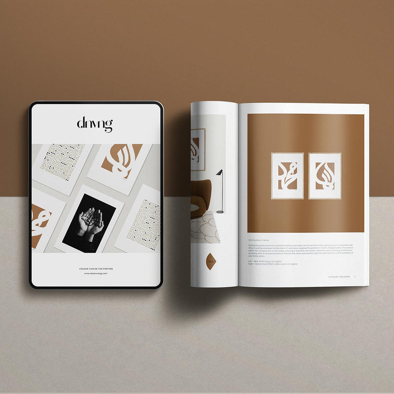
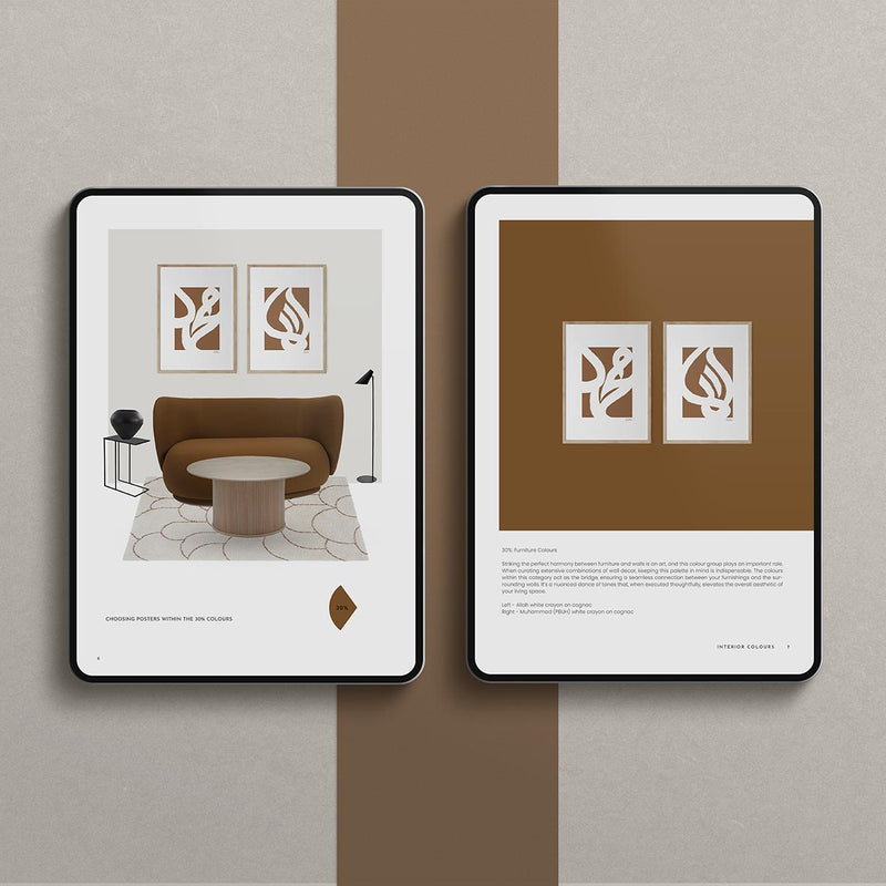
Selecting the right colors for your posters can be a bit overwhelming. If you’re unsure where to begin, take a cue from your room’s existing colors. One effective approach, often used by interior designers, is the 60/30/10 rule. This entails 60% neutral colors, usually found in the walls or larger surfaces, 30% for the colors of substantial furniture like sofas or beds, and finally, 10% for a standout color that adds detail to the room. In this edition, we provide illustrations demonstrating this rule, along with posters that align with this principle. Enjoy the inspiration!
Table of content
- How to find and choose the right colours of posters
© Doenvang, 2024